TrustFlow
peer-to-peer Zero Interest Loans
TrustFlow is a proposed mobile app that connects individuals who would like to borrow money with individuals who would like to lend to them. Because the loans are interest free, this is a charitable activity for the lenders.
The following is a case study showing how the application was designed.
The Problem
Given that many people live paycheck to paycheck, and may be unable to keep an adequate emergency fund on hand at all times, individuals often run up debt that becomes increasingly difficult to pay back as interest accrues.
A Possible Solution
A peer-to-peer lending application that offers zero interest loans with flexible payback terms would help.
The Goal
To provide a simple-to-use, nonthreatening, but secure application enabling lenders to make direct loans to individuals in need of a helping hand.
Borrowers would pay the loans back
within a flexible time frame,
without incurring interest.
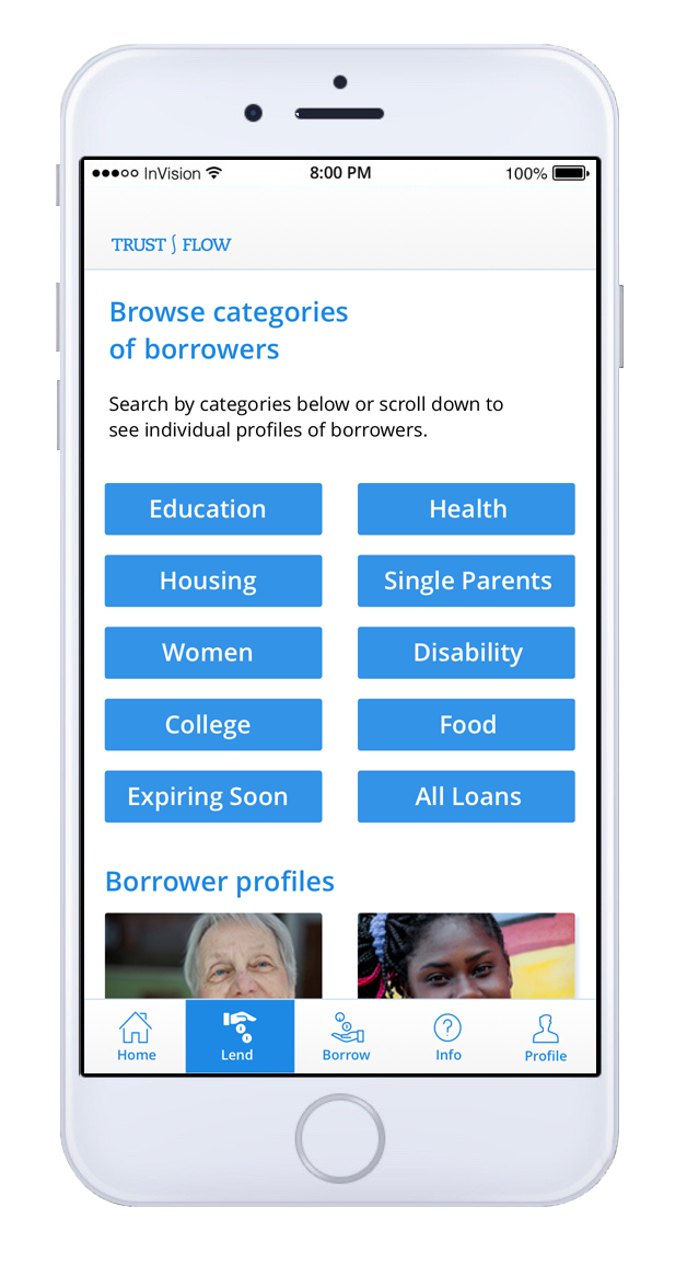
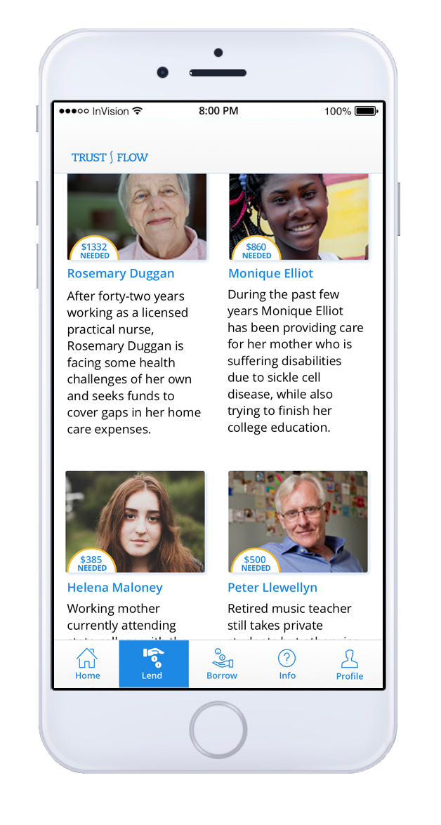
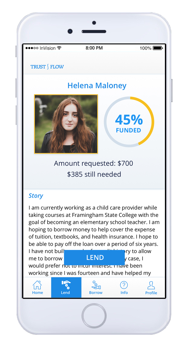
Lenders would be able to browse the stories of potential borrowers and select individuals to whom they felt moved to lend.
A potential lender browses potential borrowers
Research
Competitive Analysis
I completed a competitive analysis and heuristic evaluation of four similar platforms:
Kiva, nonprofit that facilitates loans to entrepreneurs
Zidisha, microlending that directly connects lenders and borrowers
Grameen America, microfinance focusing on low-income American women
Go Fund Me, not loans but funding for individuals and organizations
The websites of Zidisha, Kiva, Grameen America, and Go Fund Me
Because for a lender this would necessarily be a charitable activity, as no interest would be earned, the application would be closer to those organizations listed above than to other traditional lending platforms.
The proposed application would be different from the first three of these organizations in that the recipient would not necessarily be a business owner. It would also be different from Go Fund Me in that the recipient, or borrower, would not be required to show a specific need or cause other than the need for a loan and as much as they decided to share of their personal story.
Interviews
I interviewed seven individuals, two potential borrowers and five potential lenders.
Concerns of potential lenders included that their money would be put to good use.
Concerns of borrowers included fears of sharing personal details online.
Survey
I conducted a survey of 55 respondents. Of these, 53% were female and 47% were male. Their ages ranged from 18 to 75 or older, and most had incomes of $50,000 or lower.
The survey showed that along with concerns about putting their information online, some respondents had distrust of unfamiliar organizations and were wary of scams.
30% said they would use the application to borrow.
24% said they would use the application to donate and 16% said that they would consider donating.
63% said they donate randomly to charity, when they are moved to do so.
Of those who said they would not use the application to borrow, the main reasons were not wanting to share personal information, trying to remain independent, having no need for it, or wariness of scams.
Of those who indicated that they would use it, most had significant debt, the main causes being medical bills and student loans. One person mentioned they had taken custody of two grandchildren and were trying to make ends meet.
KEY INSIGHT I had assumed when coming up with the idea for this app that few people would actually lend or donate. So I was not sure if the application would be viable. But the survey I took showed that 24% of those surveyed would lend and another 16% would consider it. So this proved my assumption wrong and surprised me!
Empathy maps helped me to understand the user's goals, hopes, and pain points.
These personas guided me in all the subsequent stages of design.
Empathy maps for potential borrower and potential lender
Personas for potential borrower and potential lender
Scenario Mapping
I gathered information from the research on post-its and arranged them into categories that began to structure the application.
Scenario mapping
User Stories
What do they want? What are their goals? Why? How? User stories helped to answer these questions and to create the tasks that would be carried out through using the application.
Card Sort
In order to further translate user’s needs into the actual tasks that the user would perform in the application, I made a list of actions and conducted card sorts, both in person with paper cards and online using the OptimalSort service. The participants in the card sorts arranged these tasks into categories. The paper card sort ended up with fewer categories than the online sort. At the end of the sort the participant named the categories (seen on orange post-its): About—more info, Join us, Lend and borrow, Connect, Profile. From this information I could begin to see the structure of menus and pages in the user interface.
Paper card sort
This similarity matrix from the results of an online card sort by OptimalSort shows which categories of tasks were chosen the most.
SITE MAP
Now that I had various categories of tasks based on user research I could begin to work out the information architecture. I came up with the site map you can see below.
User Flows
Working from the site plan, I made user flows for the different paths a user might follow when using the application. The most important user flows were those where the user either borrows or lends. My first attempt at these flows is shown below. At this point I began to consider making this a mobile app, so that users could access it from anywhere.
User flows, for the borrower (left) and for the lender (right)
Design
Now that the basic structure had been established I began to design the individual screens. Based on the user flows I made some initial sketches.
First sketches for lender's flow
Moving into the Sketch application
As these sketches of ideas began to gel I moved into Sketch to refine them.
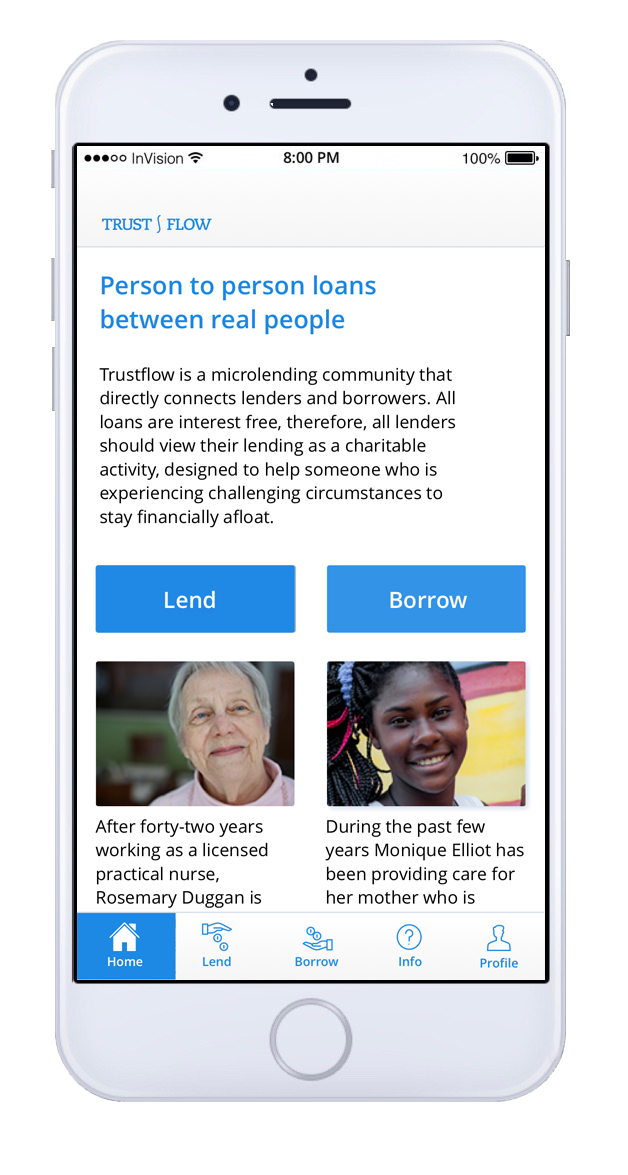
Below are three screens showing the evolution of the home page from first sketch to rough wireframe to finished version.
How the home page changed from first sketches to the final version
design decisions
In designing the interface I decided to stick to Google's Material Guidelines as much as possible. I also browsed through pattern libraries for ideas. The blue was chosen to inspire trust and comfort. Here are some screens that show specific decisions made during the design.
The Style Guide
I started a style guide to record my choices and for other designers to use in the future. As I continued to iterate I updated the style guide.
Moving to InVision
When the flows in Sketch were fleshed out I synced the files with InVision and began to add interactions.
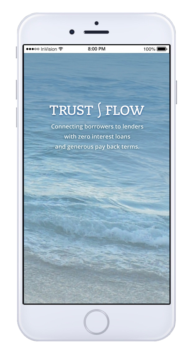
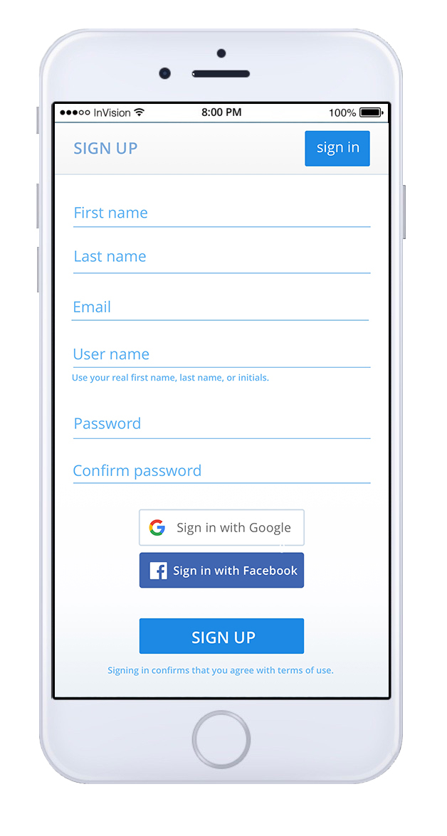
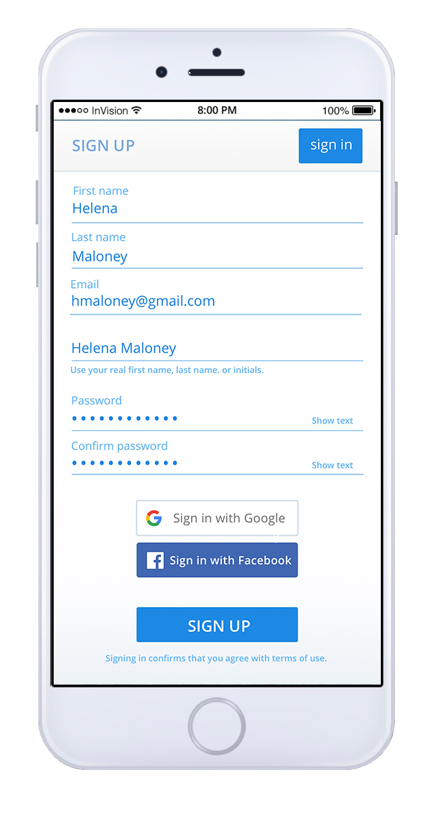
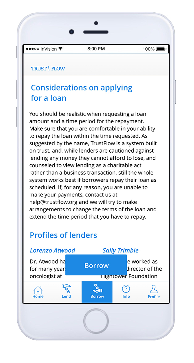
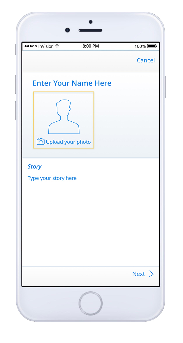
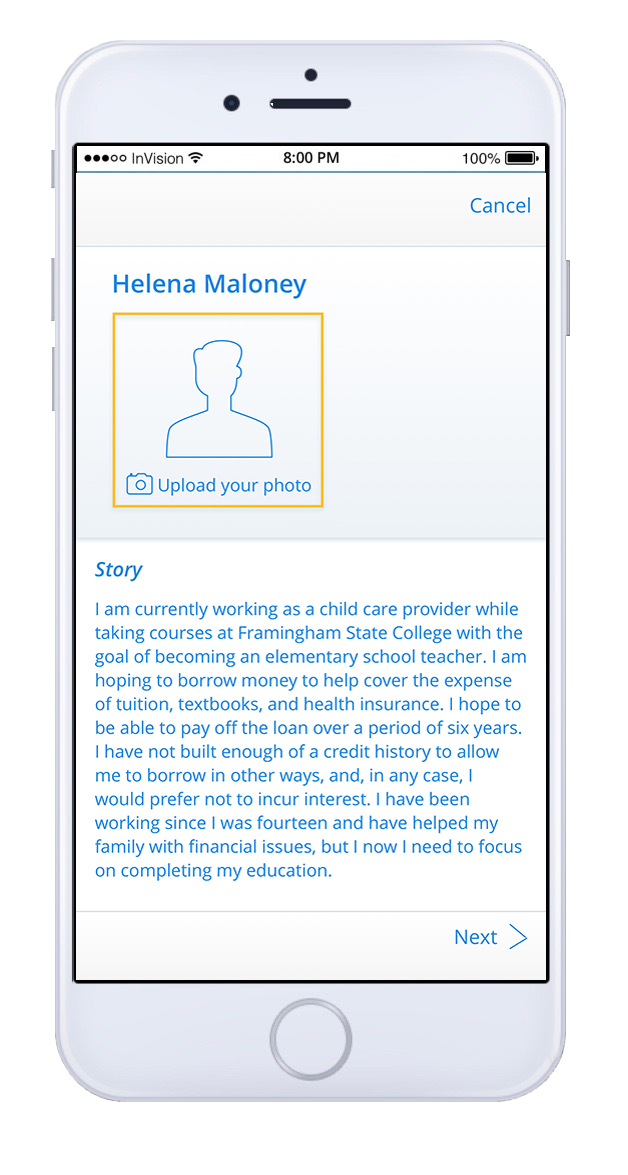
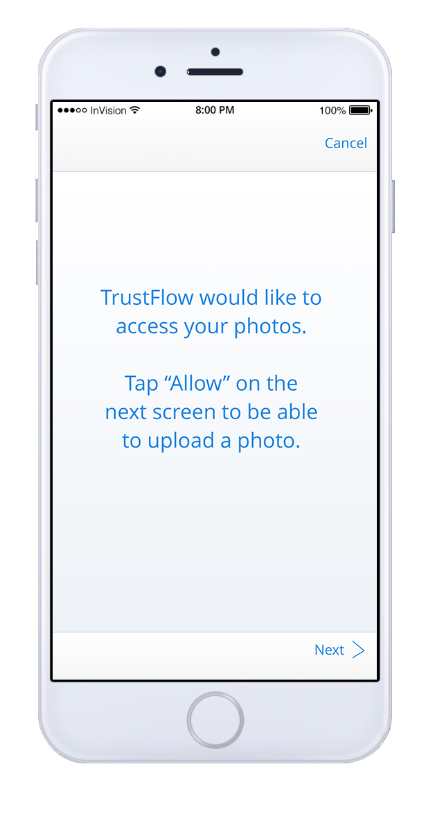
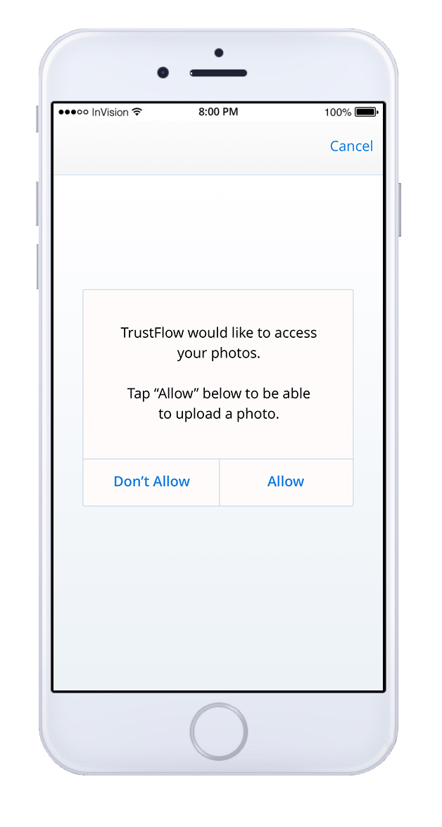
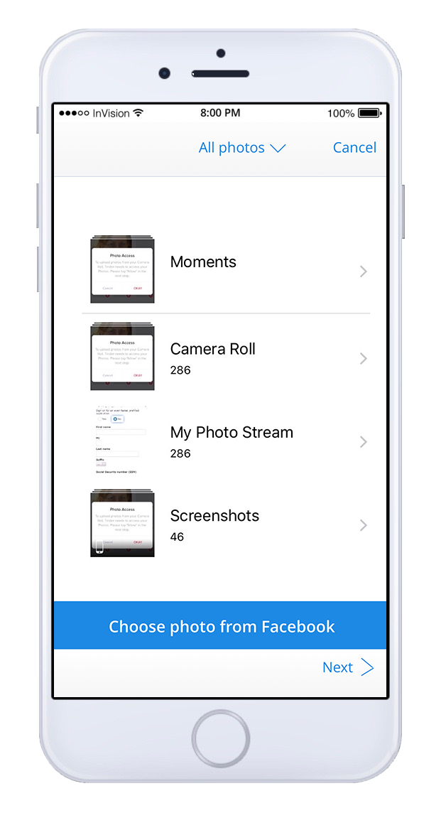
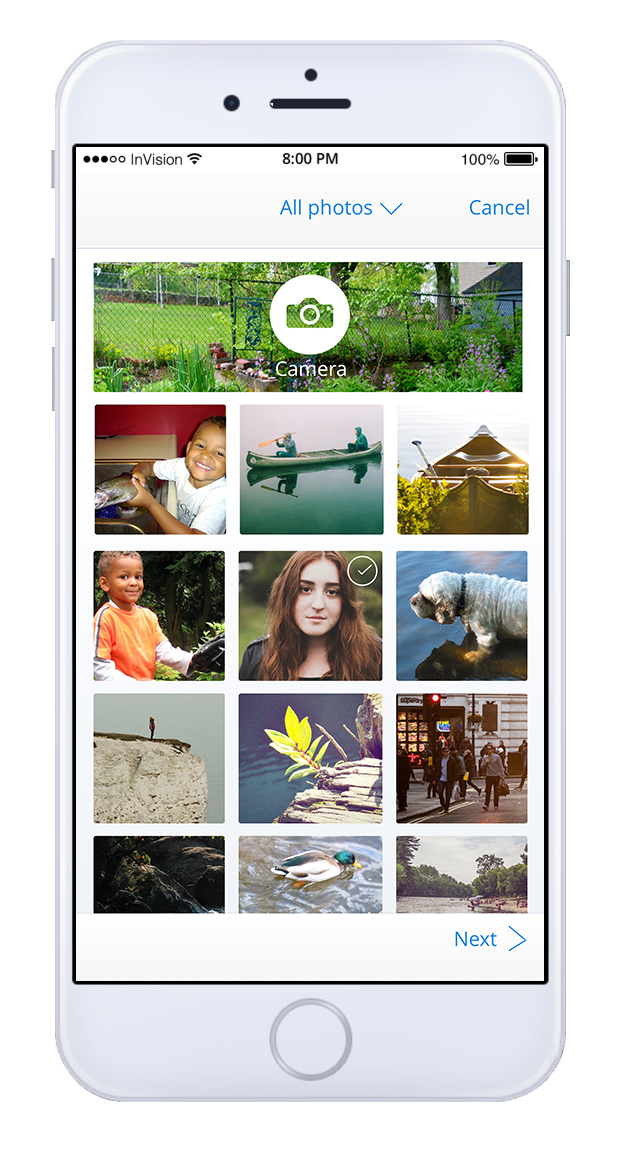
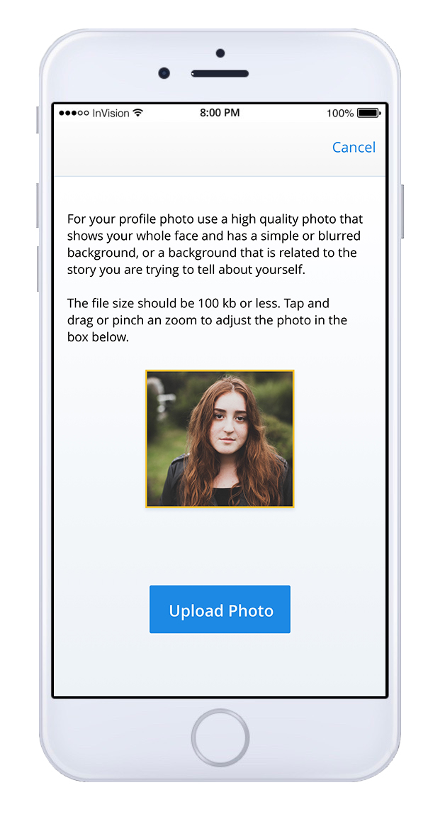
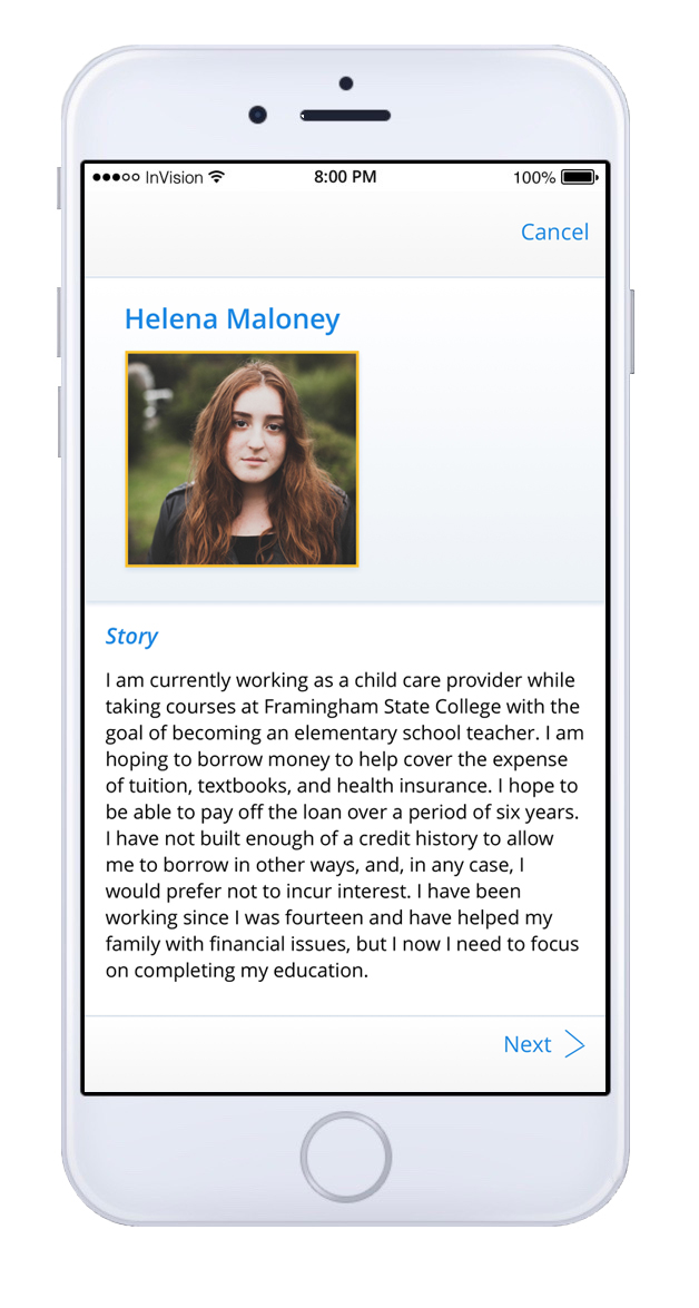
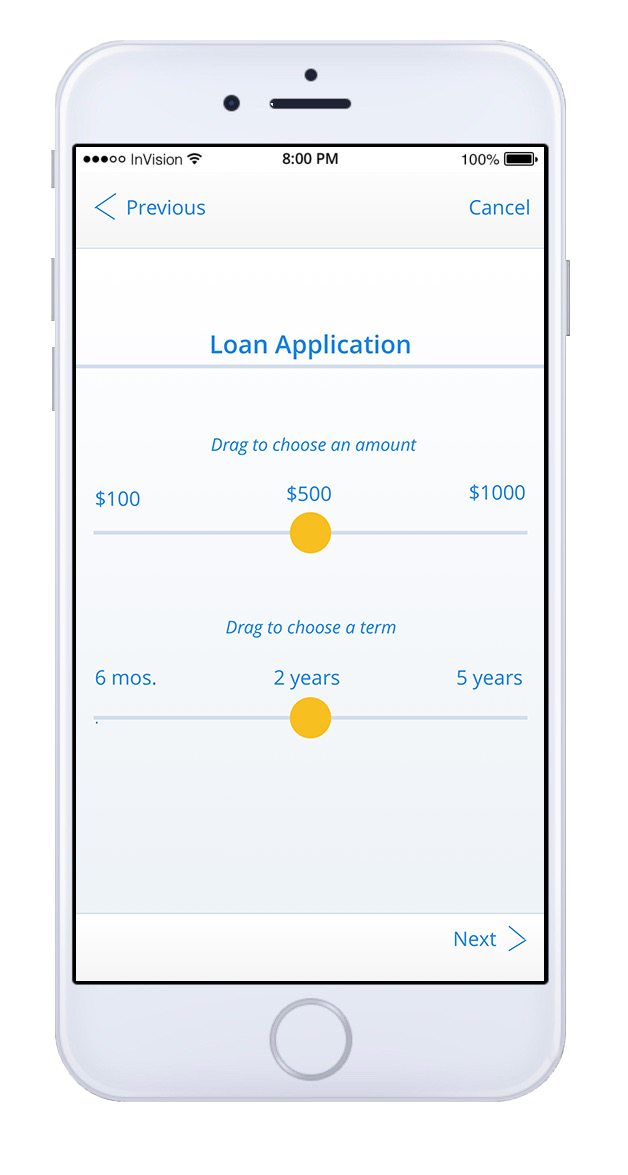
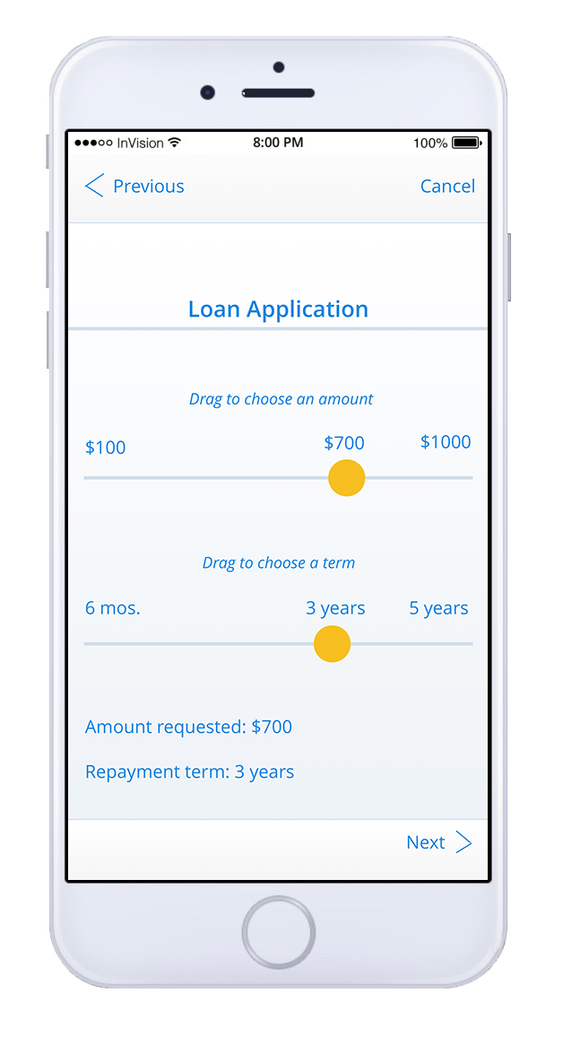
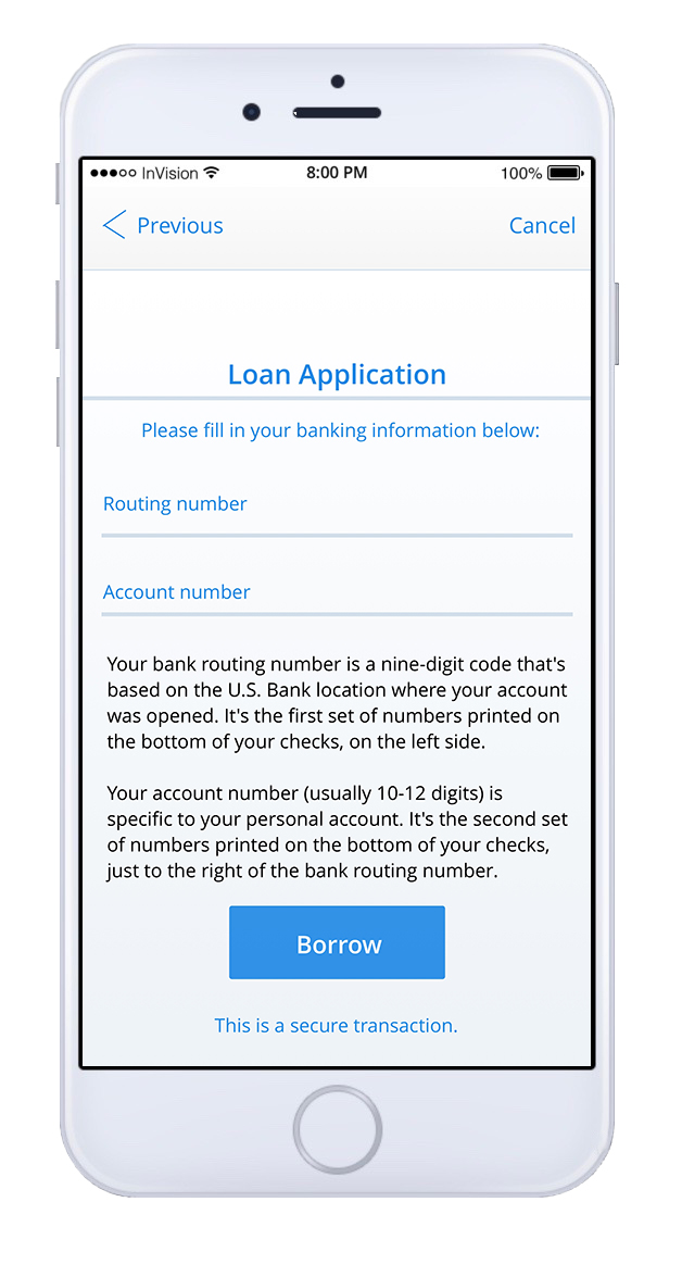
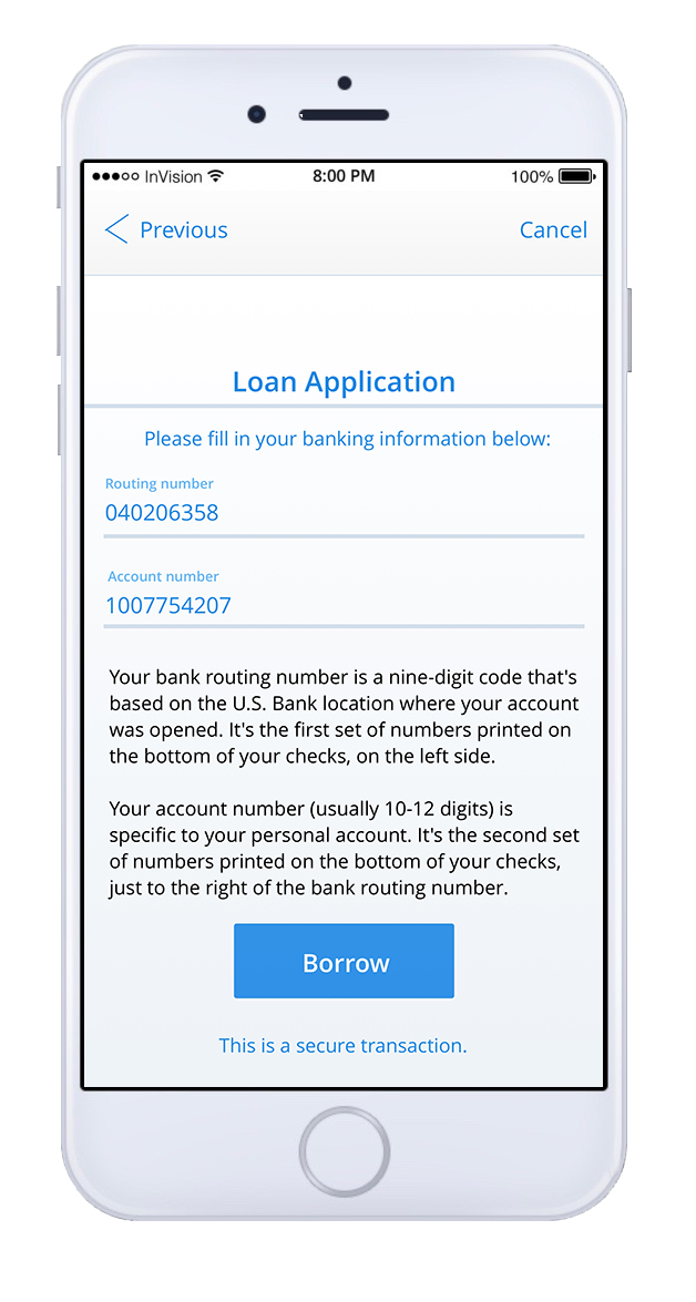
The Borrower Flow
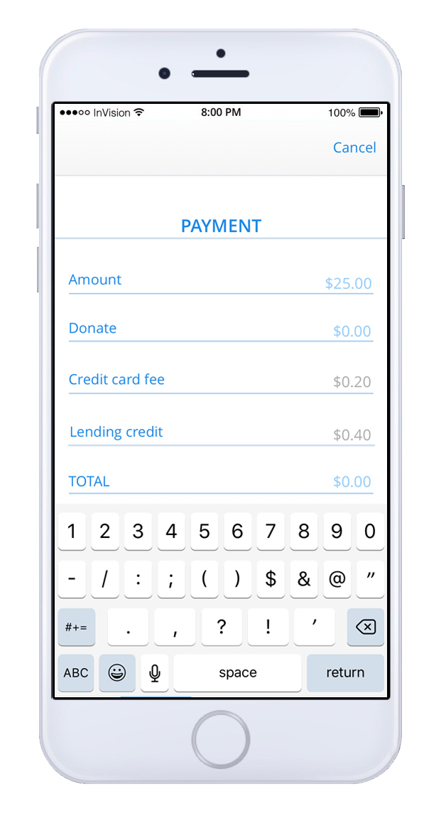
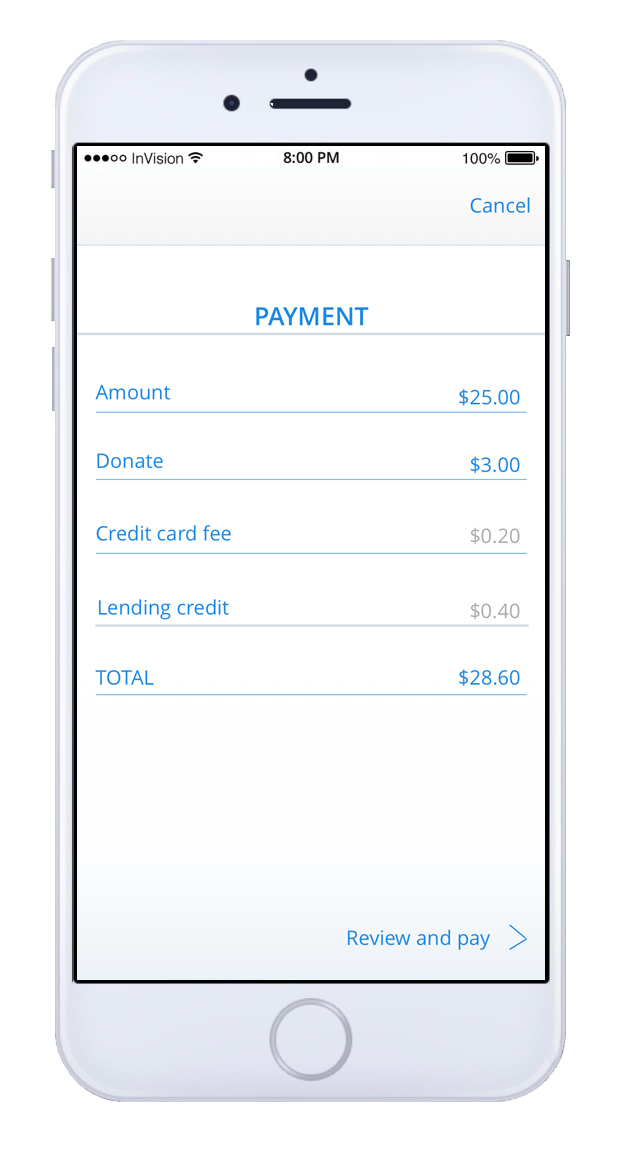
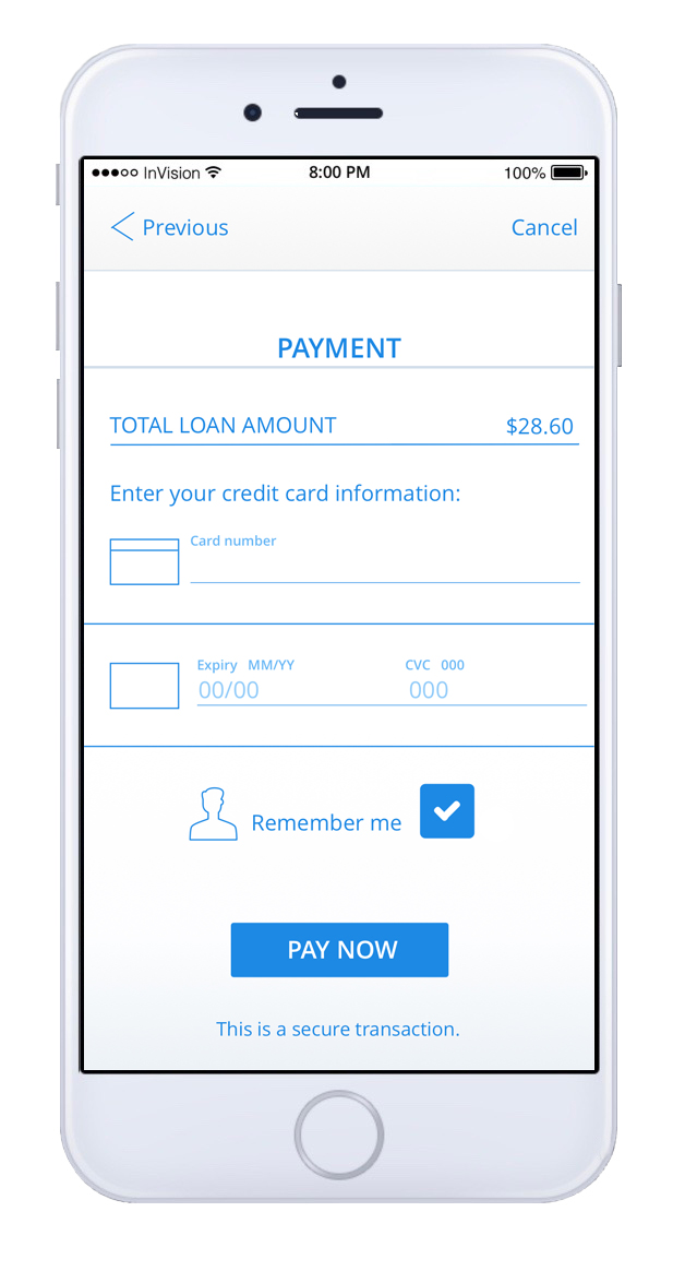
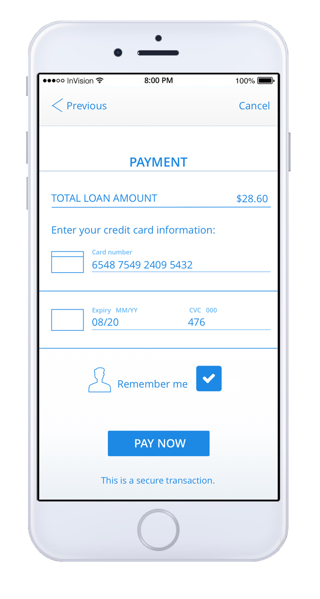
Click the arrows to the left and right of the prototype screen below to move through the flow, or use the thumbnails below the screen.

The Lender Flow
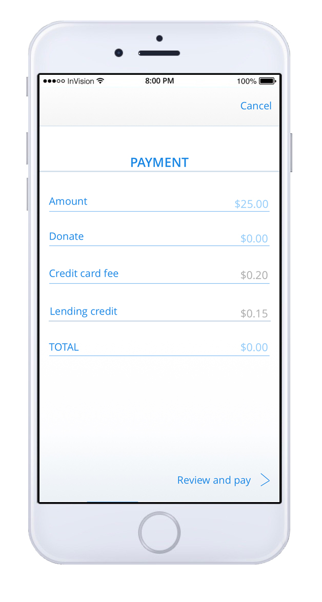
Click the arrows to the left and right of the prototype screen below to move through the flow, or use the thumbnails below the screen.

user testing
Once the lender flow and the borrower flow were complete I did one in-person moderated user-testing session and five remote, unmoderated sessions through UserTesting®. I asked the participants to go through each flow and let me know if this was an application they would use, what they liked or did not like, and what they would change. Here is some of the feedback I received:
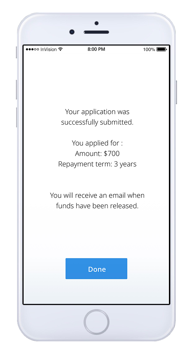
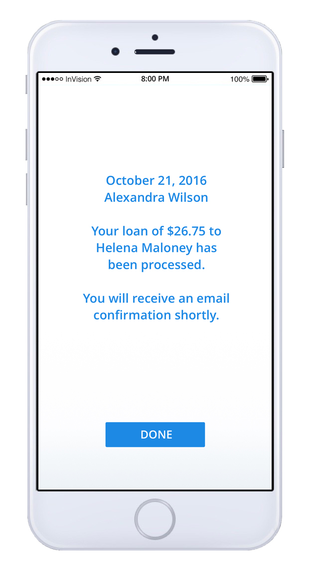
Some users were unsure what to do next once they received the confirmation that their loan application had been submitted. To fix this I inserted a link on the "Done" button that takes you back to the Home page.
Users found the dummy text (lorem ipsum) that I had used confusing. They were not sure what it indicated and, in one case, wondered why it was not in English. To fix this I replaced it with real copy.
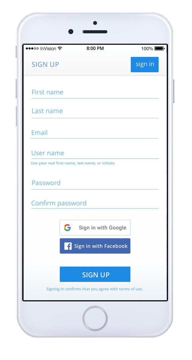
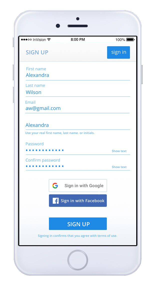
People liked that you could sign up with Google or Facebook.
Users found the sign-up process easy.
Four out of five remote testers said this was something they would use or that there was a need for, and the fifth person said she would not use it only because she never either borrows or lends money.
Conclusion: What now, what I learned, what I would do differently
If I were to work on this again, I would conduct initial research without specifying what I envisioned the completed app to be. Perhaps knowing my vision of the app led respondents to state that they would use it, while whether or not that would actually be the case is unknown. I would also conduct more rounds of interim user research, before the high-fidelity mockup was created. More testing and iterations could be done, a web version might be added, and the visual appeal of the interface could be improved before the app is sent to development.


